Blogger: Rachel Kent
Location: Books & Such main office, Santa Rosa, Calif.
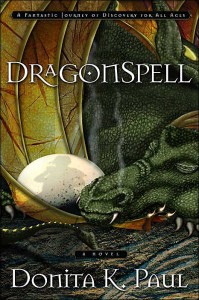
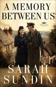
As you saw from yesterday’s example, the cover of a book alone usually shows the reader what genre the book falls under. That’s one of the benefits of genre; the title and cover align with the story to help the reader identify the genre. This is a “truth” that’s ingrained in each reader. If a reader enjoys a particular genre, he’s going to look for a certain tone on the cover, a fitting title, and even a particular type of font on the cover and title page.
A horror novel should never be called Waterfalls of Love, and a flowing, cursive script should not be used to write that horror novel’s title and author’s name on the cover. Genres demand a certain “look.” Waterfalls of Blood is an appropriate title for a horror novel, and I’m sure you can all imagine the cover. Ew.
Think through these genres: romance, sci-fi, fantasy, historical. These books all have a specific look, don’t they? Any genre should bring to mind a cover type. Some books don’t fit the mold, and it’s dangerous for a publisher or author to take a step outside of the norm. This can negatively affect the book’s sales and popularity because the book’s “look” confuses the audience.
Here are some covers that show the genre well in title, font, and image:


Can you think of any other books that show the genre particularly well on the cover? What do you imagine your book cover will look like for your current work in progress?

I think Jill Williamson’s books (By Darkness Hid and To Darkness Fled) have fantastic covers. And Shade by John B Olson, too. Great stuff. I love looking through book covers, just to see how creative it is. Then, when I finish a book, I look at it and think, “Yep, that fit.” or “Nope, not even close.”
It’s a challenge, I’m sure, for artists to capture the book with just a picture.
Great post. Congrats on getting married.
My current WIP is in the romantic suspense genre. I envision a contemporary-looking gal with maybe a tattered cowgirl hat and maybe a bluebonnet stuck in the hat. (Bluebonnets play a role in the story.)
Another story I finished recently absolutely must have a woman in a wedding dress, sitting on a Harley. I’ve already got the perfect picture.
Ha! That’s probably why I’m a writer not a graphic designer!
Fun to think abut though.
I love covers. A good cover will make me pick up the book and want to know more (I know, don’t judge a book by its cover… but there it is lol).
Being a fantasy/sci-fi lover, I think Marcher Lord Press has put out some great covers for their books. Sometimes the covers for these genres can look a bit cheesy to me, but those books look great!
I tried an experiment w/the three covers here. I shrunk the page, until the covers were about the size displayed on amazon.com (I have a mac, so it only took a few pinches).
The Dragonspell cover became indistinguishable. The others remained clear. That’s my new test. The genres came thru clearly on A Memory Between Us and Married but Not Engaged. I really like the Dragonspell cover, but I had to study hard to see that it was a dragon.
The only cover most potential buyers will see is the small image online. To me, this is a hugely important design point. Unless the cover looks good when it’s tiny, it doesn’t work. In fact, it’s no longer the cover that sells, but the “icon” you create for your book, which is then applied to the front of print editions.
That’s my measly 2 cents.
Bill
And may I add my congrats on your marriage. God’s richest blessings on your new life together!
When I read this post, I couldn’t help thinking of the old and new covers for Golden Keyes Parsons’ In the Shadow of the Sun King, a historical fiction with a touch of suspense. I quite enjoyed it! The original cover design conveyed all of those things with class, but the new cover design would make me think it was a historical romance if I didn’t know better. Perhaps the publisher was trying to appeal to a broader market?
The setting of my stories is usually thematic, almost becoming a secondary character. I imagine them with covers that strongly feature landscape elements.
Great points, Bill! The covers are usually small in a magazine or online, so it is very important that they are still clear when they are small. 🙂 Thank you for the wedding congrats!
Teri, I do think it’s fun to imagine future covers! That’s why I asked you to do so. It’s good to have an idea because the design department at a publishing house will often ask the author for his or her thoughts on the cover before they get started on the design.
Lynn and Morgan, I’m checking out the covers you mentioned now…thanks!
I love book covers.
It fascinates me to see how creative and smart cover artist can be. I respond to a book FIRST by it’s title and cover, THEN I read the back for content.
My next book has had a cover in my dreams for a long time 🙂
I can’t wait to see it on a shelf!!
I’m reading on an T-touch and can’t see a thing on the dragon cover–bill makes a good point. On the other hand, a number of the books I have on this Kindle ap have nothing but the title– in which case a good “Back cover” description is essential.