Blogger: Janet Kobobel Grant
I recently stumbled onto a blog post that got me thinking about the process I use to choose the next book I’ll read. Emily Gatlins’ post was a recap of books she chose over a 90-day period, based solely on their covers–not taking into consideration who the author was or what the book was about. Just that the cover drew her in. You can read her post here.
Nowadays it’s a lot harder to select books based on covers because we tend to have limited exposure to covers. Since I buy most of my books online, I see covers that are suggested to me by whatever online venue I’m using. I also see covers scroll by on my Facebook wall. And, if I check out what’s on the Goodreads shelves of friends, I see covers.
But that really adds up to pretty limited exposure, doesn’t it? I can recall a decade ago loving to roam bookstore aisles, just to give some book cover an opportunity to shout, “Pick me up!” at me. I discovered Maeve Binchy and Margaret Atwood that way many years ago.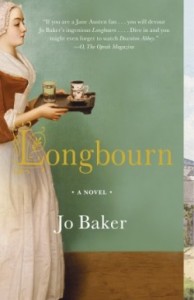
Currently, I’m reading Longbourn. (Because Wendy told me I had to, that I would love it. And I do.) Would the cover have caused me to pick it up at a bookstore? I don’t think so. It’s not a bad cover, but it seems kind of quiet to me.
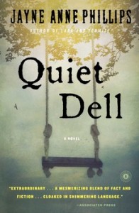 On the Barnes & Noble site, the books suggested to me on Longbourn’s page didn’t have covers that attracted me except for Quiet Dell. But I’m concerned it might be a dark novel, and I don’t usually enjoy them. So I’m hesitant to give it a try.
When I went to the publisher’s site to download the cover image for Quiet Dell, I was offered up other book covers to consider. The Violet Hour called out to me, not because of the cover art but because of the title. It’s lovely, and I want to know more.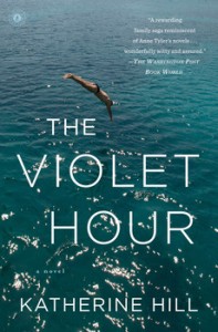
Before I could settle on The Violet Hour, my eyes caught on All We Had. I love the bright colors and striking image. Yup, have to check that one out.
A book that I’m going to read because I can’t stop looking at the 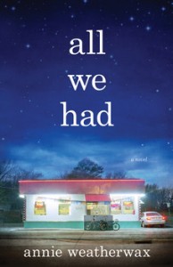 cover is The Butterfly and the Violin. I find the art so pleasing, the soft palette so inviting, and the mix of images so lovely, I can’t say no to this book.
Now that I’ve taken you on a tour through book covers I judge with a thumbs up, let’s ask, So what? Here’s the thing, beauty is in the eye of the beholder. Some of the covers I gravitated to might have caused you to think, Really? That cover? No way.
But as writers, it’s important for us to figure out what makes a cover 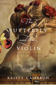 work and what makes a cover fail. Because at some point you will sit in front of your computer screen and see what the publisher envisions as the right cover for your book. Most likely that design will bear little resemblance to what you had been dreaming of. Now what? Is it a good cover?
Here are qualities that make a cover “good”:
–Is an accurate reflection of the book’s tone. Quiet Dell is a dark book–I read the description of it, which I know was a total cheat. The gloomy cast the fog gives the cover, the empty swing, the shadowy feel, all add to the sense that the story isn’t going to be lighthearted.
—Suggests what the book is about. All We Had is about a single mom and her daughter, who finally gain a glimpse of what it means to belong when they settle in a small community, and the mom works as a waitress at the local diner. That ray of hope is reflected in the lighting of the cover, which in essence puts a spotlight on the diner. It’s a story of hope but also of disappointment, and the cover reflects that with the dark sky.
—Doesn’t try to tell the entire story. Have you ever picked up a book and felt that the cover gives your eye such a dizzying array of objects that you can’t figure out what to focus on? That would be a cover that’s trying too hard. Simple images often work best. While The Butterfly and the Violin has three images, the cover feels like one image because the design subtly directs your eye in a way that isn’t jumbled but feels orderly.
—Looks good large and small. In the past, a cover needed to beckon to you from a bookshelf. Now it needs to stand out when it’s displayed online. Our first glimpse at a cover is usually a small image. It needs to be striking, first, when it’s small and then, when we click on that image and go to the book’s page, when it’s large.
—The title is easy to read. As was true with The Violet Hour, the title can sell a potential buyer on your book. But if the buyer has to work really hard to read the title, that might be a clever design, but is it a good design? Probably not.
Because I started my cover journey with a novel, that quest led me to other novels. So it’s only fair that I let you consider some nonfiction covers. Which, if any, of these appeal to you? Why?

What book did you buy based on the cover?
TWEETABLES
What makes a book cover good? Click to tweet.
What book would you read if you chose it solely for the cover design? Click to tweet.

 A Manuscript’s Finishing Touches
Kingdom Of Ice. Subject, beauty.
Open also looked interesting. Hatmaker’s book not at all. 🙁
Michelle, I like the clarity of the design for Open, with it’s big and bold title.
I’d read Longbourne based on the cover.
Kingdom of Ice reminds me of the epic fantasy covers of the 80’s, with their sweeping vistas and if characters were on the cover, they were tiny little splotches of paint.
Me, I love covers with characters on them, even if only a hand or a foot or an ear. Or an eye. Especially eyes.
As I occasionally work at a library (thus feeding my reading habit), covers will often catch my attention and I end up going home with almost more books than I can carry.
That said, when I first looked at Interrupted’s cover, that would have been a complete turn-off. Then I read the subtitle: “When Jesus wrecks your comfortable Christianity”. That line alone is hooky and makes up for the ugly brown boring cover. I wanna read it now.
Heidi, that’s a good point about covers being a big draw when you use libraries. Obviously, I’ve fallen out of the library habit since that didn’t even occur to me.
I didn’t care for Interrupted’s cover either. I mean, out of all the colors in the rainbow, why choose brown? Especially for a book written by a woman, which means mostly women will be likely to read it. But the subtitle makes all the difference in the world–if the potential reader gets that far in the selection process.
Even though there’s an overuse of different types of font on the cover of In the Kingdom of Ice, it still appeals to me.
The cover of The Light Between Oceans drew me in immediately. It indicated possible mystery and sadness, and the story delivered both.
The titles below are on my Goodreads list, in part, because the covers intrigue me.
Letters from Skye
Ella Minnow Pea
The Widow’s War
The Unlikely Pilgrimage of Harold Fry
The Night Circus
The Misbegotten
For Such a Time
The Thirteenth Tale
The Sentinels of Andersonville
My Name is Resolute
Flight of the Sparrow
The Paris Architect
Has anyone read these? If so, do the stories match the cover art?
Jenni, the cover for The Light Between the Oceans caused me to pick it up, too.
The Sentinels of Andersonville is a great cover as well. Very different yet very telling about the time period, and a good match to the story itself.
Jenni, I have read Ella Minnow Pea, which is, simply, brilliant. I’ve also read The Thirteenth Tale—basically a gothic novel, and I enjoy a good gothic and did enjoy this. (Kate Morton is the queen of them, IMHO.) And I’ve also read The Night Circus, which was my favorite book of 2012 (I blogged about it, so you can do a search if you’re interested), and which I did buy partly/mostly based on the cover. I had it in hardback, though, so it’s the hand with the circus tents and clock in the palm, which is positively gorgeous; later versions added silhouettes of the 2 main characters, and I like that much, much less, thought it cheapened it. Ella Minnow Pea is one of those that had 3 very distinct covers, so I can’t say which one you’re looking at; the copy I have is green. 🙂
Jamie, I agree that The Night Circus with the two silhouettes isn’t nearly as engaging as the previous version. I checked online for Ella Minnow Pea and saw two very different covers–each with a different subtitle. I don’t think I’ve ever seen such a thing before. Now I’m seriously curious about the evolution of the book cover and title.
The little voice in my head critiques the image that goes with each on-line news article, often judging it irrelevant, misleading or downright dumb. Now that you brought it up, Janet, I realize I critique covers the same way. I’m put off when the image doesn’t match the content.
Designing a cover that works equally well in hand and as an icon is a challenge. For authors with multiple books, a consistent format with the title and author’s name in clear type is more important than ever.
I am intrigued by the placement of the Interrupted title, but the colors convey a sense that the interruption is unwanted. Maybe red would be a better match to the subtitle.
Shirlee, that’s a good suggestion for a different color for the Interruption title. It would help to pop up the cover and make it draw more attention.
Going back a few years, the cover to the early editions to Andrew Greeley’s “The Cardinal Sins” was reputed to be extremely effective in getting people to at least pick up the book.
You can see if here –
http://smile.amazon.com/CARDINAL-SINS—-BARGAIN-BOOK/dp/B001DQQDSS/ref=sr_1_8?ie=UTF8&qid=1408364746&sr=8-8&keywords=the+cardinal+sins
It seemed to promise titillation, especially since the author was a Catholic priest, but what readers got was a solid story of temptation, sin, and redemption, and they were introduced to an author they could grow to love over a long career.
(The cover for the current edition is nowhere near as effective.)
Andrew, such a cover on a novel by a priest would definitely be newsworthy. In that era, covers just weren’t done will that much skin revealed. Wow!
Janet, In the Kingdom of Ice appealed to me because it appears peaceful … majestic … though the topic may not be.
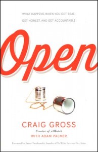
When I looked at Open … I couldn’t figure out what the images were. Was something spilled? (my initial look) Then I eyed the author’s last name under the “spilled item” and I read Gross. That was not appealing at all. 🙂 I’m just being honest.
I think the image on Kingdom of Ice is intended to convey quiet, killing kind of beauty.
When I first saw open, I saw it small and thought the objects were thimbles. That had me puzzled. I’m still not totally sure what we’re supposed to think of the cans…how poor our communication with each other is?
What an interesting topic with which to start the week! Thank you, Mrs. Grant.
I am not impressed with the cover of “Longbourn”, but this may be because it is reminiscent of my nurse bringing me unpalatable medication when I was a child, and ill.
Could you be so kind as to offer a few words on spine design for new authors? I still purchase most of my books from the shelves in local bookstores, and it is the combination of title and spine that draw my eye.
If I may, I would like to offer to observations:
First, a long title offered in sans-serif print against a plain background gives the book an academic flavour, which mitigates against my choosing it.
There would also seem to be two distinct schools of spine design – “thin book” versus “thick book”, with the latter using either a dedicated image or a wraparound.
Surpreet, since most covers are displayed in bookstores and libraries spine out, designers try to put an image to make the book stand out from all the other spines. But a book has to be a certain width to have sufficient room to add an image. It really can make a difference in how many people then pull the book out to look at the cover.
A plain cover with a sans serif title doesn’t do much to open up our imaginations and invite us into the book, does it?
Thanks for showing different covers and for explaining what to consider when creating a cover for a book. I’m with Michelle: I like the In the Kingdom of Ice cover and the Open cover. In the Kingdom of Ice is visually appealing with its contrast of lighter and darker colors. I like the font of the title Open. It’s fun, and the red on white catches the eye. Interrupted doesn’t draw me in. I think it’s the colors used. The way the one word title is broken up though…..very clever.
I love the color of The Butterfly and the Violin! This book is on my TBR list. 🙂
The red title on the white background on Open, with a great font, makes the cover. Put a different color and less interesting font on that cover, and it would immediately turn bland.
The book I’m currently excited to read based on the cover is Susan Meissner’s Secrets of a Charmed Life. The design is intriguing, the image appealing, and I WANT that dress. http://susanlmeissner.com/cover-reveal/
Susan’s Charmed Life cover is very inviting. The outfit is so attractive that you want to BE that character and dress like that. Everything about the cover is lovely.
But speaking of great covers, I have to mention yours, which is inviting on so many levels. It speaks of abundance and the irresistible lusciousness of a ripe peach. http://www.barnesandnoble.com/w/miracle-in-a-dry-season-sarah-loudin-thomas/1117107059?ean=9780764212253
Totally agree: LOVE Sarah’s cover!
Oh, Sarah, I love that cover. And Janet’s right: your cover is inviting!
Open appealed to me instantly.
I actually liked the cover for Longbourn. And the Butterfly and the Violin is beautiful. I like the bottom half of All We Had.
Somewhere else I’ve noticed covers is on Pinterest. Usually on there, I am scrolling by too quickly to really read any tag lines or even notice the author. So a cover itself can really pop out at me. The Vacationers was the most recent one. I haven’t read it yet, and I don’t know anything about it, but I saw it on Pinterest and it looked like something I might enjoy at the beach 🙂
Angela, the vacationers is a great cover because of the imaginative way the water is used as the background, with the floating people. Love it because it makes you stop and study it, and then you realize you want to be in that water, too. http://www.barnesandnoble.com/w/the-vacationers-emma-straub/1117225056?ean=9781594631573
I like “All We Had,” “Quiet Dell,” and “The Butterfly and the Violin” of the covers you showed above. I’m reviewing a book right now that I chose mostly because of the cover — “All’s Fair in Love and Cupcakes.” I LOVE gorgeous book covers. 🙂
All’s Fair in Love and Cupcakes uses such attractive colors and is very smart in the use of fonts, too. And that cupcake, well, I think I need it right now. http://www.barnesandnoble.com/w/alls-fair-in-love-and-cupcakes-betsy-st-amant/1117445659?ean=9780310338444
And the story more than lives up to the cover. It’s so well done. The same with Kristy’s book. The covers are excellent, but the stories will keep you coming back for more. And LOVE Susie’s new cover. WOW!
The Butterfly and the Violin softly invites my attention, and gives me the desire to read more.
Interrupted catches me with the subject matter, but the cover is very bland.
The original cover for “Catcher in the Rye” was ugly, ugly, ugly…But it became a best seller. Go figure.
Agreed on Catcher in the Rye. But I guess when a book becomes required reading for generations of high school students, it doesn’t really matter what it looks like–it will sell many copies nonetheless.
When I was in high school, the school didn’t require we read it, but we required each other to. You know, high school students reading about a wild child…we so wanted to consider what it would be like.
Thank you for another thought-provoking blog, Janet.
I like the cover for The Butterfly and the Violin because of its romance and grace. Also, like Heidi, I am pulled into a book by the people on the cover (who sometimes look nothing like the characters). I also like the muted colors on that cover because it gives an effect of softness.
As a lover of fantasy and the Medieval period, if there is a dragon, unicorn, castle, enchanted forest, faerie, or Merlin-like wizard on the cover, I’ll probably investigate the book: read the synopsis and (if I’m in the bookstore or library), I’ll glance through the book. I honestly don’t remember ever buying a book (or even checking one out from the library) solely because of the cover.
Christine, you’ve mentioned something worth noting for all of us: certain genres tips us off that genre-lovers will love a book because it gives them what they long for, whether that’s fantasy, suspense, or a romance.
While Interrupted’s cover is unappealing to me (colors and typestyle), it caught my eye because of the prominent position of the author’s name. I’ve been hearing about Jen Hatmaker and bought one of her other books, so depending on whether I like it (haven’t read it yet), I might buy others by her–or not– no matter what the cover looks like.
I think the In the The Kingdom of Ice cover is beautiful, and I love the title. If it were fiction I’d snap it up (suggests magic and mystery), but I’m not a big fan of harrowing true-life adventure stories, so the subtitle clarifying the nature of the book is an important factor to me. The cover of Open catches my eye because of its clarity and cheerfulness. Love, love, love the soft, romantic, antique look (and title) of The Butterfly and the Violin.
You’re right that Jen Hatmaker’s name is one of the first places your eye goes to on Interrupted’s cover, even though it isn’t the biggest type. The black stands out when all the other colors are muted.
I would so love to hear the designer’s explanation for why the cover was done that way.
I mean, I get the “interruption” of Interrupted, and the shift in color from gold to brown, but why those unoutstanding colors? It’s a mystery to me.
Out of the covers you put in the post the only one that appeals to me is The Butterfly and the Violin. But am I likely to pick it up right now? No. It’s Christian fiction, and I’m tired of Christian fiction right now.
Covers are a BIG part of the draw for me. If I like the cover I check out the blurb. If I like the blurb I look at how it’s shelved on Goodreads. (I do most of my book browsing on Goodreads.) If there’s no objectionable shelving I proceed to the reviews. Then I see if my library has it. Book buying budget right now is reserved for authors I currently read, not trying new ones.
If it passes all those steps I’ll read it.
Getting the cover right for my upcoming release was of paramount importance to me. I’m self-pubbing, so getting it to match my vision–and what romance readers like on covers– was a little scary when I started, but turned out to be easy. It’s a hero-centric romance so he’s front and center on the cover.
I love his POV best, so I gravitate to covers with men on the front. When what’s inside the book doesn’t match what’s on the cover it makes me mad, so I made sure what’s on my cover matches what’s in the book.
Yeah, covers that suggest the story is one thing (or the characters look one way) and then the book’s interior doesn’t deliver…it’s a major disappointment.
When I first glanced Open, I saw a thimble and a spool of thread with a threaded needle. I like to sew, so that intrigued me and drew me in. To-do’s are closing in on me today, and it was a glance at lightning speed. After closer examination, I see that it’s one of those tin can telephones. (I think? Correct me if I’m wrong.) That’s not as interesting to me, but now I have the sewing image stuck in my head and I still have some interest in the book. Hmmm. I imagine cover design is a tough job because you never know how someone’s personal interests, preferences, or issues will cause them to perceive it. Beauty is in the eye of the beholder.
Meghan, I so agree about the sewing imagery. That was my first impression, and now every time I look at that cover, I have to remind myself those are tin can phones, and have no connection to sewing. I personally think it’s a flaw in the cover that the image is so hard to see.
I even had my reading glasses on and couldn’t see the image clearly. 🙂
Shelli, and you’re seeing it larger than it first appears on Amazon.
The cover of The Butterfly and the Violin got me too. You will enjoy it Janet. I read it in two days. So good.
Ooh, thanks for the encouragement to dive into it.
I love this post! I can’t help wondering how many people who dislike the “Interrupted” cover are a bit, ahem, older. Say, over 35. I’ve found a striking difference between the kinds of covers that attract us “older folk” and the ones that the 20- and 30-somethings prefer. I would hazard a guess that the younger Christian readers would gravitate toward Jen’s cover. Just a thought!
I’ll bet you’re right, Rachelle. The Interrupted cover seems “crunchy”–brings to my mind terms like “authentic,” “real,” “streetwise,” “unvarnished.” In other words, “gritty over pretty.” I’m grandmother-aged and (not coincidentally?) all over covers that scream “pretty.” (Is “screaming pretty” an oxymoron? LOL!) So while the cover might not reflect my taste, it’s really not about what I like–I’m not the target audience. Good food for thought.
Maybe someone should grab “Screaming Pretty” as their tagline for romantic suspense. You’re welcome. 🙂
I actually think it’s the colors, Rachelle. I’m a wee bit past 35, and the title and tagline grab me. It’s the colors that don’t attract me…
Any of our 20- to 30-something readers, please chime in regarding your response to Interrupted. Are you attracted to it? If so, what does it say to you?
While the colors aren’t my favorite, and it’s not pretty (in the usual sense), I like the cover (and I’m 34).
I think they made Jen’s name easy to see because she’s big right now and has an edginess and invites attention.
What I like about the cover is the chalkboard feel of the bottom, the pencil-lined letters, and the box around “wreck.” All of this adds to the theme of interruption, change, editing. God has permission to rewrite our lives. I like it when covers show the theme.
I don’t like it when covers have full body views of characters. Or I get tired of how heroines in suspense novels always have perfectly smoothed and straight hair (so unlike mine in the North Carolina humidity).
This book caught my eye as I was looking at Interrupted. http://www.amazon.com/Wherever-River-Runs-Forgotten-Renewed/dp/1434707350/ref=pd_sim_b_4?ie=UTF8&refRID=0BVQ12MY9HKKC3KZXKZ3. To me, this cover promises a journey, and the open horizon signifies freedom. Perhaps I think too much in metaphor!
Sondra, thanks for your thoughts on Interrupted. I agree with the aspects of the cover that you like, but I’m still stymied by the use of drab colors. Seems strange. I checked out Wherever the River Runs and realized I’d seen it before. It draws you in because it puts you in the boat; that makes if feel as if reading this book will take you on a journey. I think all that you saw in the cover was meant to be conveyed, and the designer did a good job.
I’m in the under 35 group and Interrupted does NOT catch my eye at all. The colors are awful, it’s hard to read, I don’t like the way it’s put together.
The biggest stumbling block is the colors. I can’t get past them to read anything else. Second biggest stumbling block is the way Interrupted is printed. I see “Rupted” first and it makes no sense. A book should never leave the reader guessing what the title is.
Rachel, thanks for going over the specifics of what doesn’t work for you on Interrupted. Hm, the cover seems to hold little appeal for most potential readers. It’s possible this one just didn’t hit the right notes for us.
I’ve read _The Butterfly and the Violin_, and it’s a wonderful, heartbreaking story, making the cover that much more inviting. Enjoy!
My sensibilities have been endorsed! Thanks, Ekta.
In the Kingdom of Ice looks really interesting to me. First of all, the title is so intriguing. Makes me think a bit about the witch in Narnia. To me, it conveys some mystery, which is appealing.
A book I bought based (mostly) on the cover was The Hatmaker’s Heart. I confess, I read the back cover copy as well, but I love the image on this book. The contrast of color is appealing to me, along with the vintage clothing.
Often when I’m looking for books or at books online I’ll notice the cover first and I’ll gravitate towards those books with interesting covers. They definitely play a big part in my decision. 🙂
Grace, I checked out The Hatmaker’s Heart cover, and the lighting is exquisite. It makes all the difference between a good cover and a great cover. Here’s the link for anyone who wants to check it out: http://www.barnesandnoble.com/w/the-hatmakers-heart-carla-stewart/1117054811?ean=9781455549948
Of the 3 you showed, I would only buy “Open” because the other 2 have titles that I had to read, then re-read. It gives me the feeling I’ll have to do the same with the content.
When I go into a thrift store I always head for the books. I buy strictly on titles and covers, just for the fun of it. I avoid buying authors I’m already familiar with, to force myself to broaden my horizons. It’s been a fun way to do so.
Denise, what an adventure of discovery you’ve made going to thrift stores. Great idea to force yourself to read previously undiscovered authors.